Motion Design Reel
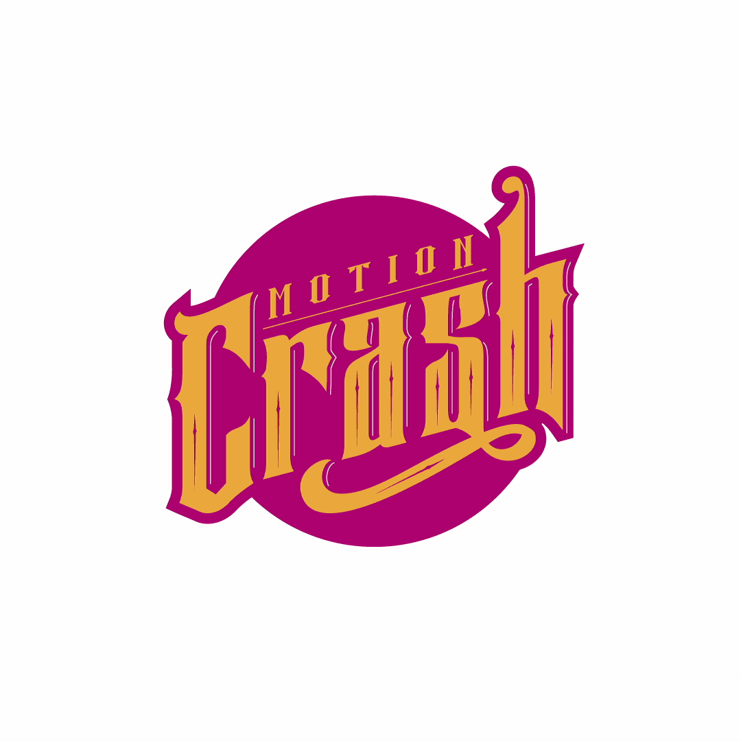
First things first. I need a logo. My goal was implied motion. It had to move even when static. Any idea of literal “crashing” would be too on the nose. cheesy and messy. I put together a quick mood-board of inspiration.

Then I started with some sketching. Then I continued with some scribbling. Then jotting. Then sketched some more.
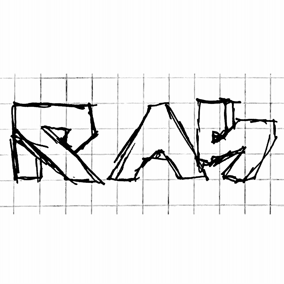
I came across a fiddly, quirky font called Stay High. ( I like to imagine Snoop Dogg as the designer, it makes me laugh) It had some elements and flow that were close to what I was imagining with my sketching. With some tweaking and reeling-in, I had the bones of the design out of Illustrator.

Color comps, Color comps, Color comps.


Next up was the reel itself. I was excited to animate this logo. I had so many thoughts going through my head. With every reel I create, I take the opportunity with the creation of the open and closing to try something new, push myself to learn a new technique or style.
Rockets! Who doesn’t love rockets? Especially since they could blow up into my logo. Yeah! Perfect.
What a failure. What was I thinking? Such a mess. I wanted to avoid cheesiness with all that I had and somehow I found myself in a mountain of cheese. I still like the idea, but my execution is a disaster. Oh well, time to shelve it and move on.
I walked away from the animation and focused on music. I’m a rock ’n roll guy at heart. Blues, punk, metal, and everything in between I’m drawn towards. My initial thought was a track called “Broken” by The Drips. It was driving, upbeat and repetitive. I took a stab at cutting it down with minimal lyrics so’s not to be overly distracting from the work itself. After needle dropping over a quick, dirty edit of my projects, it became clear that it just wasn’t going to work. The raunchy, aggressive nature wasn’t matching the style of my work. So I broadened my search. I leaned into the golden-age of hip-hop. I came across an instrumental track of “The Main Event” by EPMD. I LOVED IT. Its rhythm and beat mixed with vintage sounds and vibes was sonically perfect. The 1,2,3 countdown made for a perfect intro. I’m getting better editing audio, but the ending needed some real love. I turned to audio aficionado and good friend Derril Sellers to clean up my edit as well as sound design the end. As always, he came through in spades.
Back to the intro/outro. Now with a clearer head and inspiration from the track, I concentrated on what was working from the design itself and not over complicate things. I still wanted it to be an opportunity to learn something new. I leaned into the bold and flow-y nature of the design and created a faux cel look. I wanted to keep the crisp vector style but have an organic, watery feel to it. A style that I thought was absent from the reel itself. It ended up being super fun and super challenging.
In the end of all of this, I have :50 seconds of all that I have to give. I concentrated on including work that showcased my diversity as an animator, video editor, and designer. I hope you all enjoy and check back periodically for updates.
Onward!